
Color does more than fill a frame — it communicates before a single viewer consciously processes what they’re looking at. In portrait photography, this psychological layer is often the difference between an image that stops someone mid-scroll and one that gets a polite glance before disappearing into the feed. Understanding how color influences emotion, perception, and storytelling gives photographers a meaningful edge that goes far beyond simply knowing how to expose correctly.
Color psychology in portraits isn’t a rigid formula. It’s a tool — one that works best when photographers understand both its science and its nuance. The same red that signals danger in one context becomes passion and vitality in another. Blue can evoke calm or cold loneliness depending on how it’s used. This article breaks down how color shapes the viewer’s emotional experience of a portrait, and how photographers can use that knowledge intentionally.
Why Color Psychology Matters in Portrait Photography
Research in color psychology consistently shows that color is one of the fastest-acting sensory inputs the human brain processes. Studies suggest that people form judgments about a visual within 90 seconds, and color contributes to roughly 60–90% of that initial impression. For portrait photographers, this means color isn’t decoration — it’s part of the message being sent before the viewer even registers the subject’s expression or posture.
In portraiture specifically, color operates on two simultaneous levels. First, it establishes mood — warm tones tend to feel intimate and energetic, while cooler tones lean into contemplation and distance. Second, it affects how the viewer perceives the subject themselves: skin tones appear healthier, more dramatic, more melancholic, or more vibrant depending on the surrounding color palette. Getting this right isn’t about following trends; it’s about understanding what emotional experience you want the image to create.
The Emotional Language of Individual Colors
Every color carries a set of psychological associations, many of which are consistent across cultures (though not universally so). Here’s how the primary and secondary colors tend to function in portrait contexts:
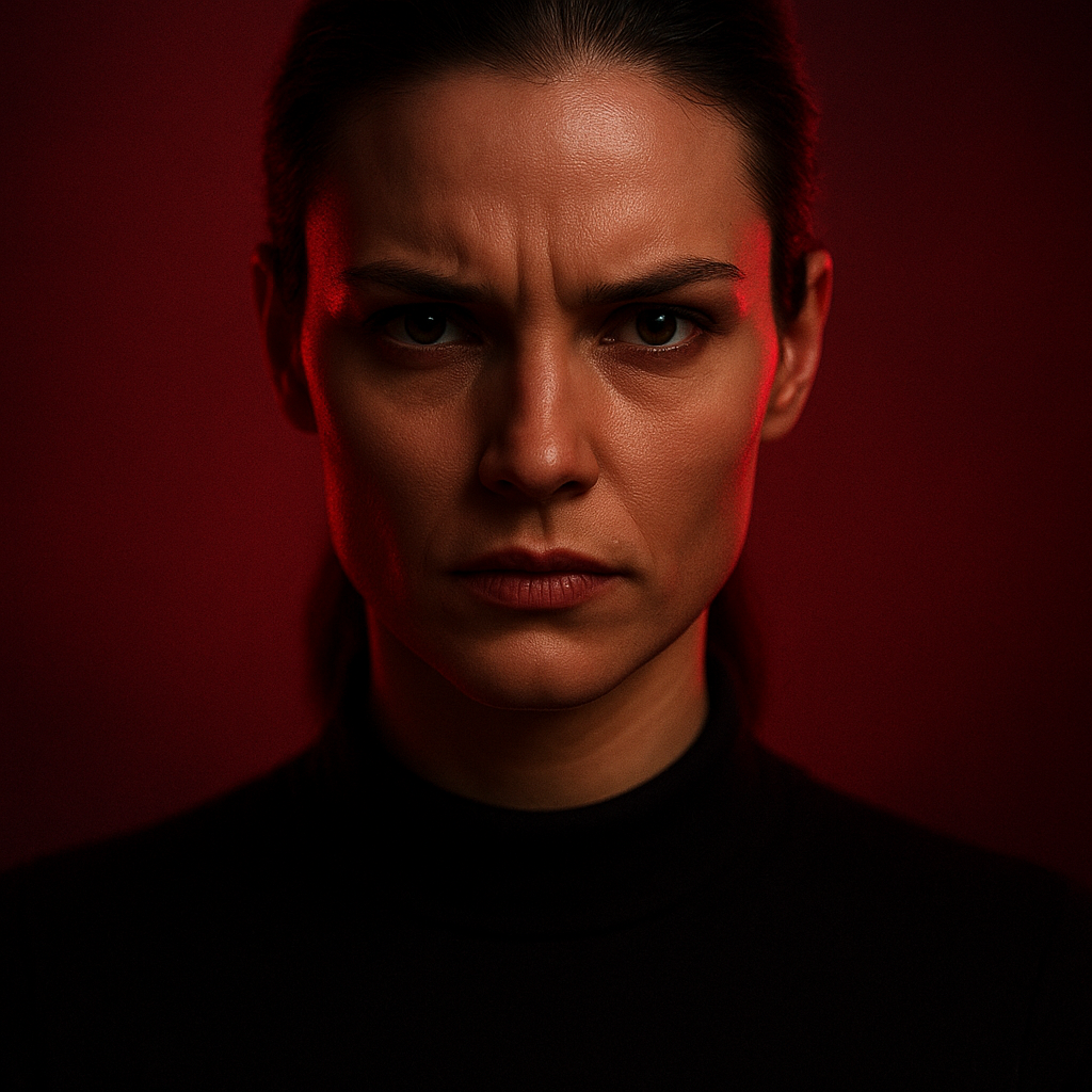
Red: Energy, Passion, and Urgency
Red is arguably the most emotionally charged color in the spectrum. In portraits, red clothing, backgrounds, or lighting creates an immediate sense of energy and intensity. It’s associated with passion, confidence, power, and — in higher saturations — anger or danger. Portraits of subjects wearing red tend to be perceived as more dominant and assertive.
Red also affects the viewer physiologically: it can increase heart rate and create a subtle sense of alertness. This makes it a powerful choice for editorial portraits where impact is the goal, but a more difficult one for intimate or contemplative work where subtlety is the priority.
Blue: Calm, Trust, and Distance
Blue is one of the most universally preferred colors across cultures, and in portrait photography it serves a fascinating double role. Soft, muted blues create a sense of calm, introspection, and even melancholy — think of the emotional temperature of a foggy dawn portrait. Deeper, richer blues convey authority and trust, which is why corporate and professional headshots often favor blue-toned environments or backgrounds.
The challenge with blue in portraiture is that it can create visual distance between the viewer and the subject if not balanced carefully. It cools skin tones and can make a subject feel emotionally remote if overdone.
Yellow and Gold: Warmth, Optimism, and Nostalgia
Yellow is the color most strongly associated with light and optimism. In portraits, golden-hour light — that warm, amber-yellow glow in the hour before sunset — is so beloved precisely because of how it transforms a subject emotionally. Skin glows, shadows soften, and the overall feeling shifts toward warmth, hope, and nostalgia.
That said, highly saturated yellow in backgrounds or clothing can quickly tip into visual tension or even discomfort. The golden, desaturated version of yellow tends to serve portraiture far more gracefully than its bright, acidic counterpart.
Green: Nature, Balance, and Renewal
Green in portraits most often arrives through environmental context — forest backgrounds, park settings, houseplants, or outdoor locations. It carries associations with nature, growth, and balance. Subjects photographed in green environments tend to be perceived as more relaxed and grounded. Green also has a leveling effect: it rarely dominates a portrait emotionally, but provides a supportive backdrop that feels familiar and calming.
Black and White: Timelessness and Contrast
Technically speaking, black and white are not part of the color spectrum, but their psychological weight in portraiture deserves inclusion. Removing color forces the viewer to engage with texture, light, shadow, and expression without distraction. Black and white portraits carry a timeless quality — they feel both archival and emotionally raw. Contrast becomes the primary storytelling tool, and shadows carry enormous psychological power.
How Color Temperature Shapes Emotional Perception
Beyond individual colors, the temperature of an image — how warm or cool the overall palette reads — has a profound effect on how a portrait feels to the viewer.
Warm-toned portraits (those leaning toward oranges, reds, and yellows) tend to feel intimate, inviting, and emotionally accessible. They suggest connection, safety, and energy. This is one reason why family portraits and lifestyle photography often favor warm post-processing: the color temperature itself reinforces the emotional intent.
Cool-toned portraits (those leaning toward blues, greens, and desaturated tones) can feel introspective, detached, or atmospheric. High-fashion and fine art portraiture often favor cooler palettes because the emotional distance they create can read as sophisticated or editorial. The challenge is ensuring that coolness doesn’t slide into flatness or disconnection from the subject.
Using Color Harmony to Strengthen Portrait Composition
Color psychology doesn’t exist in isolation — it intersects directly with color theory and the relationships between colors within the frame. Understanding basic color harmony principles helps photographers make intentional decisions about backgrounds, wardrobe, props, and lighting.
Complementary Colors
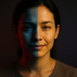
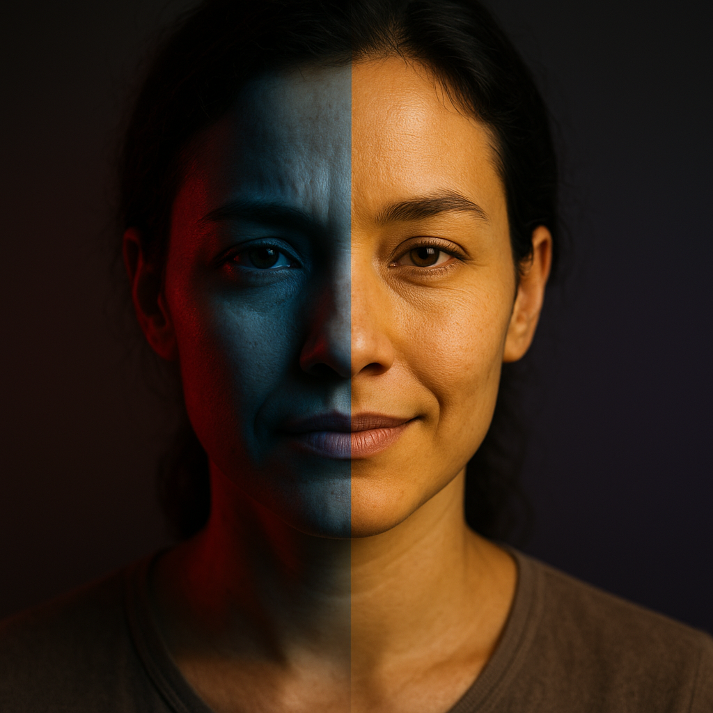
Complementary colors sit opposite each other on the color wheel — orange and blue, red and green, yellow and purple. When used in portraits, complementary color schemes create visual tension and vibrancy. The subject naturally pops from the background when their clothing or skin tones contrast with a complementary environmental color. This is one reason why the orange-and-teal color grade became so popular in cinema and photography — it works with natural skin tones (which trend warm) against a cool background.
Analogous Colors
Analogous color schemes use colors that sit adjacent to each other on the color wheel — blues and greens, for instance, or reds and oranges. These create a sense of harmony and visual cohesion. Portraits using analogous color schemes tend to feel more serene and unified. They’re less visually aggressive than complementary schemes, which makes them well-suited to intimate or nature-based portraiture.
Monochromatic Schemes
Monochromatic portraits use variations in lightness and saturation within a single hue. These images have a strong, unified mood and a distinctly artistic quality. When done well, a monochromatic portrait in deep teal or warm ochre can be extraordinarily powerful — the restraint itself becomes expressive.
Skin Tones and Color: A Critical Relationship
One of the most important — and sometimes overlooked — applications of color psychology in portraiture is how surrounding colors interact with the subject’s skin tone. No color exists in isolation within a portrait; every background tone, piece of clothing, and light source affects how skin reads to the viewer.
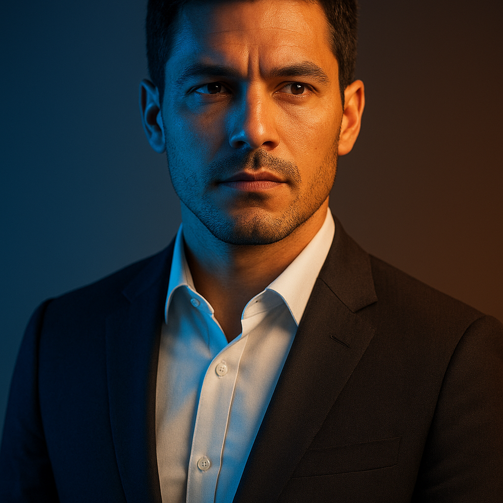
- Warm backgrounds (amber, terracotta, golden tones) generally complement warmer skin tones and can make lighter skin appear luminous and healthy.
- Cool backgrounds can create striking contrast against warmer skin tones, making a subject pop dramatically — but can also drain warmth if not balanced with complementary lighting.
- Green and yellow backgrounds can introduce unwanted color casts into skin tones if the subject is close to the background, particularly in natural or mixed lighting.
- Neutral backgrounds (soft grays, whites, creams) give skin tones space to breathe and allow the photographer maximum control over the emotional temperature of the final image through post-processing.
Understanding how color affects perceived skin tone is especially important when photographing subjects across a range of skin tones and ethnicities. A color grading approach that works beautifully for one skin tone may not translate well to another, which is why developing flexibility in color work — rather than applying a single preset to every portrait — is a more sophisticated and respectful approach.
Practical Ways to Apply Color Psychology in Portrait Sessions
Theory is most useful when it translates into actionable decisions. Here are ways photographers can start thinking more intentionally about color before, during, and after a portrait session:
- Plan wardrobe conversations intentionally. Ask subjects about the emotional tone they want from their portraits, then connect that to color choices. Someone who wants to project warmth and approachability might gravitate toward earth tones; someone who wants to convey authority might lean toward deep navy or charcoal.
- Scout locations for their color palette. A brick wall, a field of wildflowers, an urban concrete environment — each brings its own color temperature and psychological associations. Knowing this before the shoot allows for deliberate, not accidental, color storytelling.
- Consider how you’ll grade the image before you shoot it. Having an emotional intent for post-processing in mind during the session means making lighting and exposure choices that support that vision from the start.
- Use colored gels deliberately. Even a subtle warm gel on a key light or a cool fill can shift the emotional tone of a portrait dramatically. These tools don’t have to be used for dramatic effect — sometimes a barely-there warmth is all a portrait needs.
- Resist the urge to over-saturate. Color psychology often works most powerfully when colors are present but restrained. Overly saturated images can feel garish and emotionally overwhelming, distracting from the subject’s expression and presence.
Does Color Symbolism Differ Across Cultures?
This is an important nuance in color psychology: while some color associations are broadly consistent across many cultures, others vary significantly. White, for example, is associated with purity and weddings in many Western contexts but is traditionally worn for mourning in parts of East Asia. Red carries good fortune in Chinese culture but can signal danger or urgency in others.
For portrait photographers working across cultural contexts — or creating work intended for international audiences — this is worth considering carefully. The emotional associations described throughout this article represent tendencies in broadly Western contexts. Being curious about the cultural background and associations a subject brings to color is part of creating portraits that feel genuinely resonant rather than assumed.
The Role of Desaturation and Muted Palettes
A growing trend in contemporary portrait photography favors muted, desaturated, or “faded” color palettes. Understanding why these palettes work — not just that they’re popular — helps photographers use them with intention rather than imitation.
Desaturated palettes reduce the emotional intensity of individual colors, which creates a sense of quietness or introspection in a portrait. They also give images a timeless, almost filmic quality that feels less tied to a specific era. This can be enormously effective for emotional portraiture where the goal is to invite the viewer to sit with the image rather than react to it quickly.
The risk of desaturation is flatness — particularly in skin tones, which can appear dull or lifeless when stripped of too much warmth and vibrancy. The most effective muted palettes are precise: they reduce saturation selectively, preserving just enough warmth in skin tones to keep the subject feeling human and present within an otherwise restrained palette.
Conclusion
Color is one of the most immediate and powerful forms of visual communication available to portrait photographers. By understanding how individual colors carry emotional weight, how color temperature shapes viewer perception, how harmony creates or disrupts visual cohesion, and how surrounding colors affect skin tones, photographers can move from making images that happen to look good to making images that feel exactly the way they’re intended to.
The most important takeaway is intentionality. Color decisions — from wardrobe and location to lighting and post-processing — should all serve the emotional story a portrait is trying to tell. When color is working well, viewers won’t necessarily be able to articulate why an image moves them. They’ll just feel it. And that invisible, emotional layer is exactly what separates a technically competent portrait from one that lingers in the memory long after the screen is dark.